Currently unavailable.
+++
title = “Mapping Public Health Projects in ArcGIS”
author = “Jason Geslois”
date = “2019-01-21”
active = false
+++
Location information is very useful in learning different qualities and aspects of the world. I think I once heard a quote that over 80% of all data in the world is related to location data. When you think about it, it makes sense because the data is tied to being somewhere in the physical space. It is a fascinating concept.
I first learned about mapping and using the ArcGIS software when I was in my Masters program in public health eight or nine years ago. Since that time, I have worked on a few mapping projects related to public health. Public health is an area that has tremendous potential for the use of maps and GIS and the importance of visualizing information to improve health outcomes and prevent disease. The benefit of using a GIS program like ArcGIS or an open source program like QGIS and R, is from their capabilities and support that are readily available as well as some of the beautiful maps that can be generated with them.
One of the challenges in using a GIS is finding data to map out. Sometimes, it is not organized in an easy to read fashion, other times because it is protected information, and sometimes it just does not exist yet. If you feel lost or do not know where to begin, I would recommend this collection of open data sources that is a great resource to begin with here.
So one of the mapping projects I wanted to work on was about a bacteria called legionella, which I have had an interest in since becoming an epidemiologist. It causes a condition called Legionellosis or Legionnaire’s Disease. This is a type of pneumonia acquired by breathing in the bacteria from things like sprinklers, shower heads, grocery store misters, or cooling towers at hospitals that aerosolize it in water droplets. It can be severe, especially in older adults or those with weaker immune systems. So to find some data on this, I read this paper regarding the counts in Europe and the authors work for surveillance on it. I downloaded the data sources they mentioned to be able to use in this example.
One of the things I wanted to visualize was to see if there was a relationship between higher rates and the location and number of bodies of water where the bacteria may be present naturally. So far I have not found a research article which examined this specifically, so this is what led me to begin researching this.
To get the waterways data, I found a shapefile of some here, although there are many different types of waterways and bodies of water across Europe. There are also many other shapefiles out there to play around with as well. For my research on this, it will be much more extensive but this post we will keep it simple just for illustrative purposes.
So now utilizing ArcGIS, with an initial base map of Europe, I added the data values with the latest rates from 2015 and added the water bodies shapefile across the continent. This is an early start, but I plan on doing more work and spatial calculations on this later as well as examining this for areas in Texas, where I currently work.

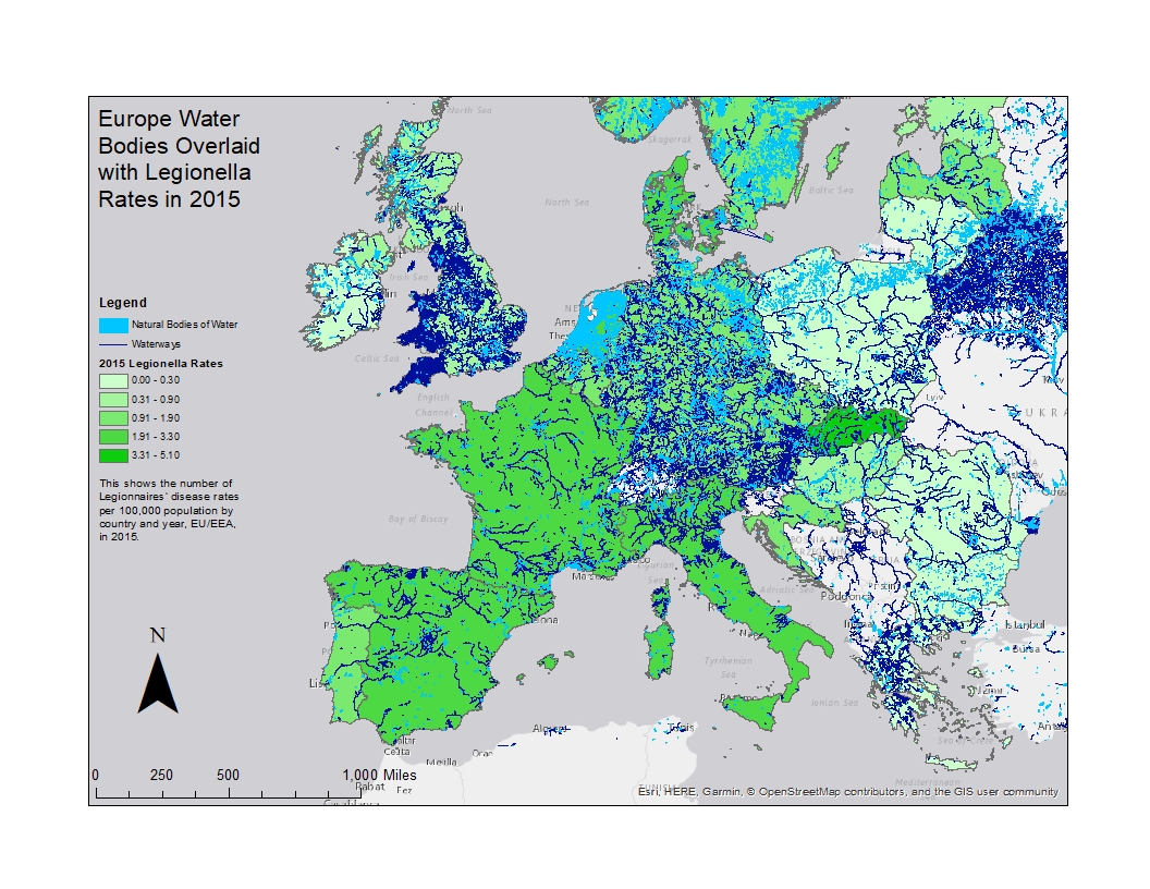
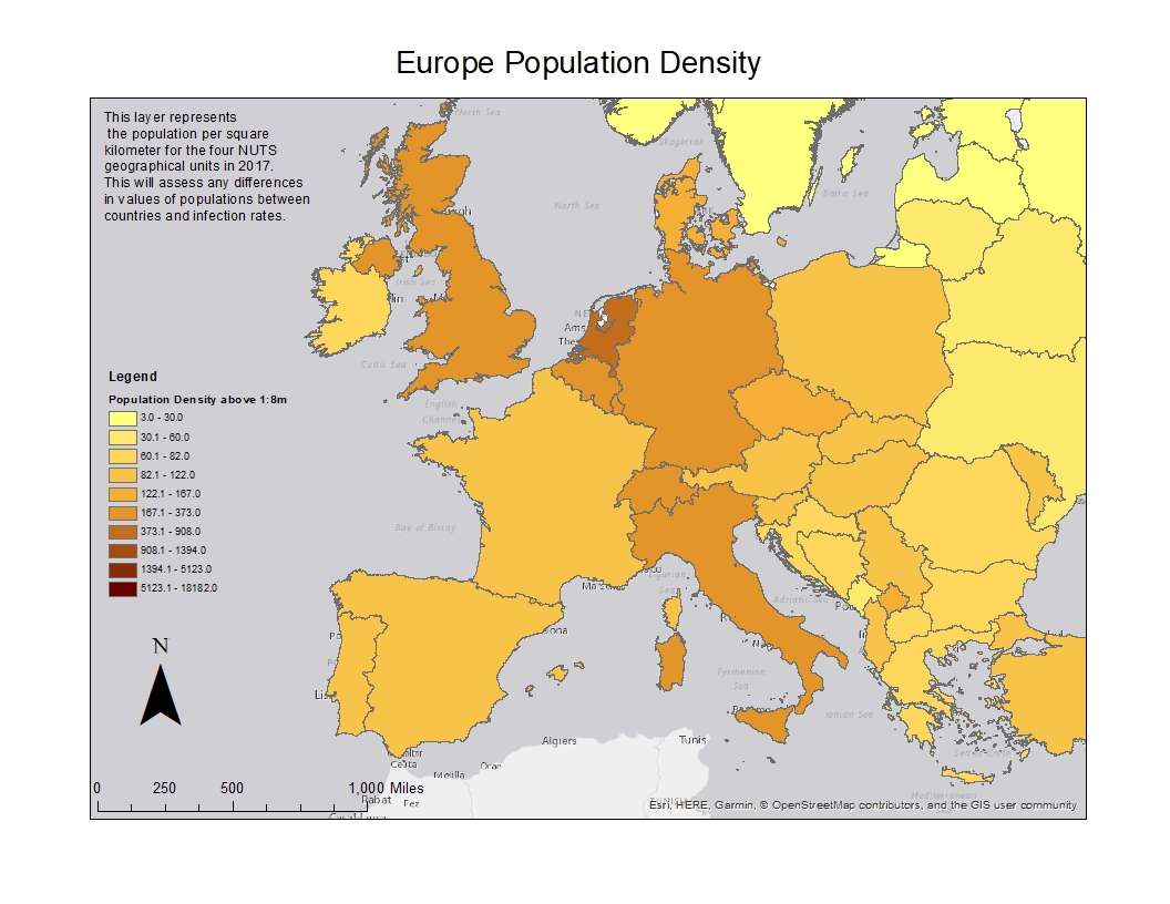
So looking at this map, we cannot make any assumptions yet for a hypothesis on if higher rates of legionella infection could be associated to the proximity of or in relation to higher concentration of water bodies between countries. We will need to narrow down our water body layers as well as examine other factors before making a determination. Other factors to consider could include population density between countries (see below),

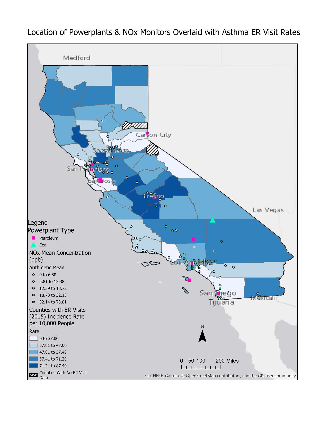
as well as differentiating between fresh water sources (where legionella is known to grow), water temperatures for their growth, meteorological factors for potential surface water distribution, etc. Nevertheless this article is not going to go into all of that detail, but it is something I will be researching and illustrates what I mean about how useful GIS is to public health. Mapping out different variables is a great way to show important public health topics which can be effective to not only bring about public health intervention programs, but also in acquiring funding, and advancing science overall. One other example I will show is a project I worked on in one of my classes for mapping the location of California power plants in relation to nitrogen oxide (NOx) monitors and their mean concentrations overlaid with Asthma emergency room visits in 2015.

When generating maps like this, one can start examining and visualizing the relationships that your data may contain. Again, there is always more analysis types you can do to further show what you are researching, but maps are a great way to show the extent of how public health can visualize the health factors in a local community and around the world. I am always interested to see others work in the field. I did not go over it in this article, but check out some of my other articles using GIS within the R program which has some powerful data tools and packages to explore.
Update: Aug 02, 2020 - added “in ArcGIS” to title.